The Function of a Studio

To me a studio has always been seen as a place to work and also to display work. In my eyes the studio had to always be a neat, tidy place which is very hard to maintain when your me as I’m very good at creating a mess and not wanting to tidy it up.

From the Key Concept Lecture I have learnt about the two types of studios and how both are a private place for an artist to be free to create and be able to create a relationship with their work.

I have always found it quite difficult to work in a studio surrounded by other people, I do not have the best attention span and at times can be easily distracted when working. I want to find a way to change this as learning about the studio and how an artist can really thrive working in their own has made me think of the posibilies and the direction my own work could go in if I were able to concerntrate more.

I think what will help me do this is by turning off my phone and keeping myself off any type of social media. If I am able to block out the Outside work and just concerntrate on keeping focused on my work I feel this will benefit my work more. I can do this by going to the library more instead of using my iPad to do research as I will not be subjected to getting distracted by noticifations. Another way of doing this is listening to music on cassette in my studio space as then the music will be a background noise and I won’t be able to change the song and then keep skipping.

I also need to get out my head that a studio has to be tidy all the time. Working in an absolute mess doesn’t always work for me but if I keep my area organised and do a clean out then I this can help me enjoy my studio space more.

Andre Stitt and his studio

Images above of Jackson Pollock in his Studio.

For one of our tutorials instead of meeting in uni I was able to go to Andre Stitt’s studio and see what environment he liked to surround himself in. The studio space that Stitt works in was a very spacious garage conversion that he had spend time creating. There was an area where you could cook, clean and eat, and room for painting and a small staircase which lead up to another floor big enough to house a storage for artwork a desk for working and a sofa. Seeing Stitt’s studio space for me was very eye opening as I feel as if a studio space is a very personal space for an artist to go to and feel inspired to work with no distraction.

Looking at Stitt’s studio space reminded me of images I had seen of Jackson Pollock working in his studio. It also made me think of my own space at uni and how neglected it looked in comparison. What I have taken from this experience is to try and find a way that I can work in my own studio space more often with out being distracted. Often when I am in a space working closely near other artists my mind wonders to what they are creating and often leaves me just sat thinking. I am hoping that maybe spending more time in the studio will help me to train myself into not being easily distracted and to improve my concentration on my own task.

Andy Warhol and Identity

IMG_0164

Above is a piece of work by Artist Andy Warhol called ‘Marilyn Diptych’. I saw this piece quite recently when visiting Tate Modern and was instantly drawn to the contrast between bright and monotone colours. What I find very interesting about this silk screen painting is Warhol’s choice of colours. In this piece the colours to the left are very vibrant, they are very eye catching and grab your attention right away especially with the white Gallery wall as the background.

What I drew me into this piece by Warhol was the face’s of Marylin Monroe. This piece made me think about what was discusses in the ideas lab about the concept of identity.

Would you know who it was if her face was taken away? What would be left of her if you were to take away her face? How would the viewer see her?

What brought me back to the ideas lab and the the subject of identity was the fact that people will know straight away who this painting is by just by seeing Marylins face; and if you were to take that away would you be able to recognise the painting?

What would I really be doing if I were to take away her face? Who would she be?

Saatchi Gallery, October 2017

This month I was able to go to London and visit the Saatchi Gallery in Chelsea. The Saatchi is one of my favourite galleries as I find the work shown there is very eccentric from many other galleries. The show on at the moment had a wide variety of different styles including textile, mixed media and abstract pieces. Below are a few pieces that I really enjoyed seeing at this Gallery visit and in particular were a few pieces by an artist called Makiko Kudo.

The three paintings that were exhibited by this artist all used a different range of colours. What I really enjoyed about his work were there are no harsh lines sererating tree from tree or and object from an object. Kudo has used different tones of colour to create a quite obvious barrier in quite an abstract but obvious way.

Another artist who’s work was very different from Kudo’s interested me which was the work by Philip Colbert which included a variety of paintings staring a lobster dressed in fried egg pyjamas. What I found interesting about Colberts work was that in his pieces he plays to our fears and hopes by highlighting the fact that social media is a very influential part of our lives. He incorporates emojis and social media logos into his work in quite an outspoken way and made me think of how his work reminded me of the cyborg constellation Lecture I had last year.

Work by Makiko Kudo above

Robert Rauschenberg

IMG_0168

An artist that has inspired my second final piece for Outside/Inside is the work of Robert Rauschenberg. What I like about this piece above by Rauschenberg is the movement of the paint and the mixture of colour. I find this to be a very effective technique by spreading the paint in different directions and creating patterns. By doing this Rauschenberg leaves the piece with a very simple but detailed look which I think adds quite a lot of character to his work. For my own work I want to recreate something like this but one a much smaller scale. I want to be able to spread colour but also let the colours mix to create lighter and darker tones much like this piece above. Even thought the paint is one of the main aspects of this piece it does not take away from the collaged photography pieces in the background. With my own work this will be a similar technique for me but mine will be writing. Applying paint on top of the writing I think will leave a very cool emboss looking effect and also add a detailed look.

img_0981

To the right of this photo are two examples of what I want to achieve. I want you to be able to see that there is writing, maybe be able to read a few words but leave the rest unreadable and covered with a mask of paint which will hopefully be a clear representation of hiding behind a wall when we think, feel and when we speak.

A Key Moment for Me This Year

IMG_0164

IMG_0165

Two Pieces Above by Dieter Roth

A Key Moment this year for me was finding the work of Dieter Roth, a Swiss artist who is well know for his artist books. (Shown Above)

Throughout the start of this first year I really struggled with what I wanted to work towards for my final pieces and also what theme to go around for Outside/Inside. When I had realised I wanted to base my work around my thoughts and feelings finding the work of Dieter Roth really inspired me to create the pieces that I did. What I really enjoy about his artist books is that it is a visual diary. He uses words, diagrams and colour to create these pieces and I think is pieces are simple but quite beautiful. All of the colours together create a very welcoming look and the colours that bleed through the pages leave quite an interesting effect. Another aspect of these pieces that I really love is that each page is dated. This relates a lot more to my first final piece then my second as on the back of each card of my first final piece is the date I had completed it and also they are displayed in order of date like Roth’s work. I have used a similar technique to Roth’s pieces above by applying colour over my writing. Doing this on my own pieces has partly masked the writing which I think speaks very loudly to the point I’m trying to make about no one really knowing how anyone is thinking or feeling. You think you know but you never will know. This leaves quite an effective look I feel and gives the piece a layered look.

Kirsty Whitlock

SONY DSC

An Artist that has inspired my second final piece is the work of textiles artist Kirsty Whitlock. What really drew me in with Whitlock’s work was the piece above. What I really like about this piece is that she uses paper as one of her chosen medias. I really love that each piece is connected using thread either by machine stitchin or hand stitching and this is something I would like to do for one of my final pieces. Another aspect of Whitlock’s work that I really like is that she uses objects like news papers, train tickets, car tax disks.etc which we see daily to create her works of art be distorting them with textiles

What I would really like to do for my second final piece is to create a patch work blanket like piece that is made us of different pieces of paper that has been layered with writing and paint. Using Whitlock’s technique will help me to bind all of my pieces together and helps to create one big final piece of the little singular pieces I am planning to make.

IMG_0167

Gerhard Richter

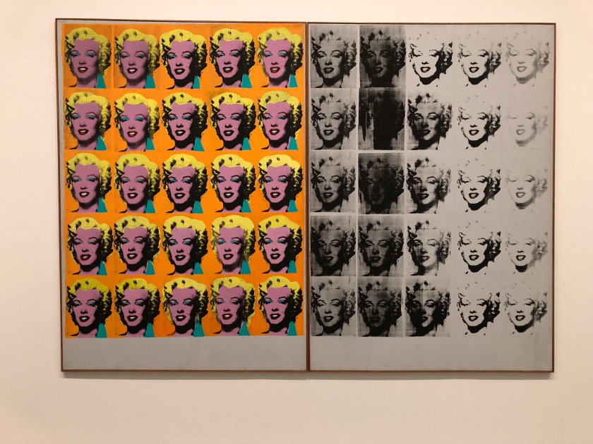
An artist that has inspired my first final piece for Outside/Inside is the work of Gerhard Richter. Whilst in London I visited the Tate Modern and was able to see a few of Richter’s paintings. Richter has created these abstract pieces by layering paint and then wiping over his canvas with a squeegee. Doing this drags the layers of paint and you are able to see the colours that were layered underneath. What I really enjoy about his paintings are the mixes of colours he uses.

Above are a collect of oil painting by Richter called ‘The Cage Paintings’. These paintings have many different textures as there are lines from where a squeegee has been dragged and paused on the paints surface, brush strokes and also areas where the oil paint has dried and created a rippled effect. There are also areas where the paint looks delicate and fluid. This collection of paintings are named after a musician called John Cage as Richter listened to Cage’s music whilst creating these pieces and wanted to name them after the composer. Richter has also been interested in Cage’s ideas around ambient sound and silence as well as his use of chance in musical composition.

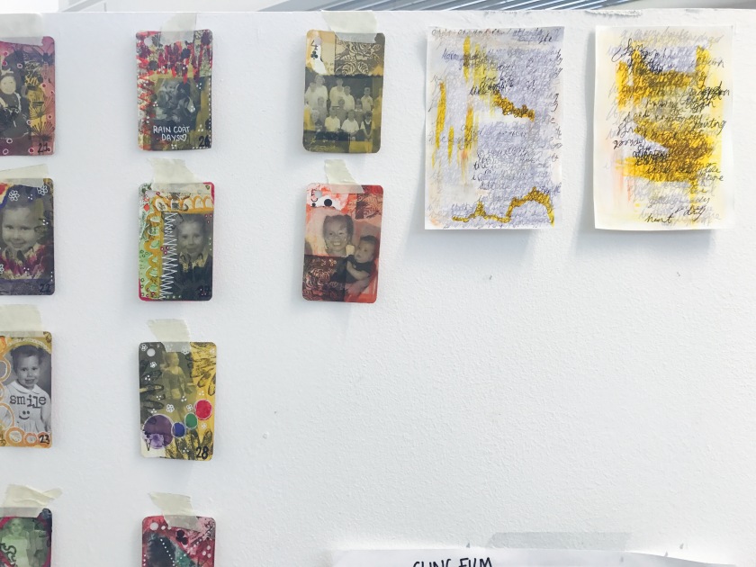
I really like the idea of listening to music and creating a collection of work. Listening to the music and creating movements of sound in paint or pen or any material. I think this could be a really good idea for when I create my final outcomes. I can listen to the music and use colour to reflect the emotions I feel listening to the song/songs and how it makes me feel. I think the way that Richter works is something that I could possibly do for my first final piece which relates to Artist Trading Cards as it is relating to my thoughts and feelings.

Update:

When creating my first final piece I listened to a playlist of music I created which reminds me of when I was a young child and also being around my mum. Whilst being at uni I have found it quite hard being far from family and friends for months on end as I had only been away from home for a week or two before hand. For my first final piece I was inspired Richter and him listening to music and creating movement. For my work I have used music to express emotion when creating my Trading Cards. Below is a list of music I listened to each day I created one of my ATC’S. Each song I have a personal connection with as they are songs that make me feel a lot of different emotions both happy and sad.


Duran Duran – Ordinary World

Cher – Believe

Candi Staton – Young Heart Run Free

Eric Carmen – Hungry Eyes

Bill Medley & Jennifer Warnes – (I’ve Had) The Time Of My Life

Bryan Adams – Heaven

Luther Vandross – Never Too Much

Duran Duran – Girls on Film

Duran Duran – Hungry Like the Wolf

Natalie Imbruglia – Torn

Robbie Williams – Millenium

East 17 – Stay Another Day

Savage Garden – Truly Madly Deeply

Deep Blue Something – Breakfast at Tiffany’s

Robbie Williams – Angels

Fatboy Slim – Praise You

R. Kelly – The Worldest Greatest

Mario – Let Me Love You

Blur – Parklife

The Ronettes – Be My Baby

Athlete – Wires

Harry Belafonte – Jump In The Line

Seal – Kiss from a Rose

Travis – Why Does It Always Rain on Me?

Duran Duran – Rio

Fleetwood Mac – Go Your Own Way

Sum 41 – In Too Deep

R.E.M – Losing My Religion

TLC -Waterfalls

Phil Collins – In the Air Tonight

Kim Carnes – Bette Davis Eyes

Enya – Orinoco Flow

Bill Withers – Everybody’s Talkin’

The Rolling Stones – Sympathy for the Devil

Bryan Adams – I’m Ready

Randy Newman – You’ve Got a Friend in Me

Bee Gees – Stayin’ Alive

Bruce Channel – Hey Baby

Cher – If I Could Turn Back Time

Cher – The Shoop Shoop Song

Cher – It’s a Man’s Man’s Man’s World

Blondie – The Tide Is High

The Monkees – Daydream Believer

Oasis – Don’t Look Back In Anger

Oasis – Stop Crying Your Heart Out

Robbie Williams – Rock DJ

Fleetwood Mac – Albatross

Saatchi Gallery, Chelsea

On Monday 8th May I went to London to visit a few art galleries. One of the galleries I visited whilst in London was the Saatchi Gallery located in Chelsea. One of the reasons I wanted to visit the Saatchi was because the current exhibition there at the moment (‘From Selfie to Self-Expression’) that I had read about online really intrigued me and I also just wanted to check out other works they had for show there. On this visit I was able to see a lot of pieces which were interactive.

Daniel Rozin – Pom Pom Mirror (2015)

Christopher Baker – Hello World! Or: How I Stop Listening and Love the Noise (2008)

Juno Calypso – The Honeymoon Suite (2015)

1D94169C-0CF4-439B-9AFE-BC73CA0C11E5

???

Daniel Rozin – Pom Pom Mirror (2015)

28121469-6F89-4052-BB9D-D23C11DDFB3B

One of the pieces that stood out to me was an interactive piece called ‘Pom Pom Mirror’ by Daniel Rozin. This piece is an electronically powered motion sensing mirror powered by 464 motors that shows your reflection using 948 Pom Pom’ s in the colours black and white. What I really like about this is Rozin’s question behind this piece.

Who is Controlling Whom?

Are we reacting to the technology or is the technology reacting to us? I really like the message behind us as it relates to my chosen theme for Constellation: Things Can Be Otherwise – I am a Cyborg. Obviously this piece of work is reacting to us as it is portraying our silhouette but is it also controlling us? By moving our arms around the the air above us and Golding different poses (as seen in the videos above) it is controlling us by subcontiously making us do weird arm motions and movements we wouldn’t normally do.